Working with Ink

As I started progressing through my final unit, I became very interested in working with drawing inks and using dip pens.

I own a set of Windsor & Newton inks – which have a really strong colour – which I find really attractive. So have been using these really heavily. I tried to use colours that weren’t usually associated with the animals I was drawing. I had decided that I was going to create a short 8-12 paged illustrative narrative, that dealt with a gay couple in a relationship. Rather than simply focusing on the idea that these characters are gay – the narrative will be more about the concept and meaning of a relationship between two people. 

ImageImageImageImage

3D Workshop

At the beginning of term, I took part in a 3D workshop – in which I created a character/ toy out of found materials or objects, charity shop purchases, old cd’s vinyls etc. So I turned up with a bag full of superglue, a kermit the frog toy, a wooden spoon and an array of objects from the kitchen and my bedroom.

We could be totally experimental, I decided to let my character come to life as I progressed throughout the workshop – so instead of planning a design at the beginning, I just got on with building and creating.

photo 2-8

photo 1-8

photo 4-3

***FINAL OUTCOME ***

(He’s a bit weird, but he’s friendly enough)

photo-5

I actually really enjoyed the workshop & liked being quite hands on with materials. It was a productive day and I am really pleased with my outcome – even if it is a little strange! Toy making would’ve been an interesting approach for me to take – in regards to the entirety of the Locating Practice itself – but I was very keen to explore ideas that focus on these throughout the development of the final unit.

Character Designs/ Story Concepts

I initially ran into the project quite excited and got straight into designing characters and scenes – I had a lot of ideas in my head and it just felt right to get early ideas out onto the page so I could begin to get my head around the characters and story working together in context.

I initially began by creating A4 biro drawings – which took ages to do as I had to keep going over the line to make it thicker – so biro’s are now longer in my pencil case!

I then took these drawings and scanned them into Adobe Illustrator, then using live trace – coloured the images.

TORTOISES

ImageImage


FROGS

Image


SNAKES

Image


DINOSAURS

Image

After visiting my friends younger brother for some research, he told me that his favourite animals were dinosaurs (Slightly awesome cause I got to draw a load of dinosaurs) They were my favourite characters that I had designed, and I quite liked the humour behind the image and after I posted it on Facebook it got a very good response! – My brother went so far as to call it “heartbreaking!”

However my work on illustrator was taking far too long, with up to 3 hours being spent on colouring the images alone! I didn’t feel like it was a productive way of working, so stripped it all back, and my focus then revolved around character design & who would fit the mould for my narrative. 

Locating Practice// Narrative Illustration.

The end of my first year is almost in sight – but I still have one more project to go! This term we were asked to focus on considering the functions of illustration and the contexts for illustration practice. We could select from several different contexts – such as toy making, portraiture, animation, reportage etc and then had to write our own personal brief.

I decided on looking into Narrative Illustration.

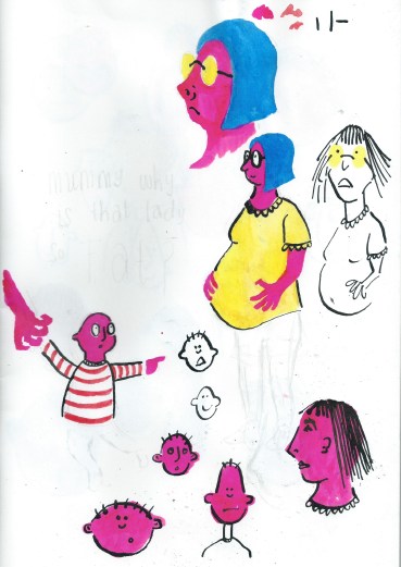
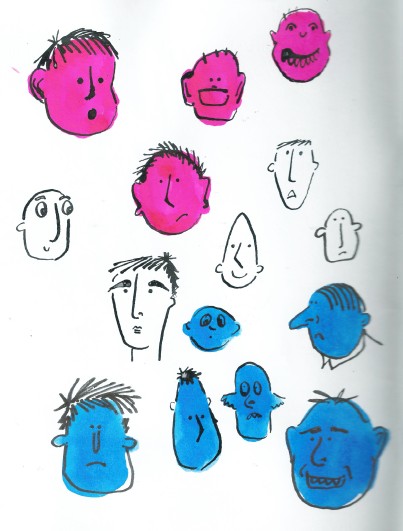
I had the initial idea of looking at the “unanswerable” questions that children asks parents:

  • Where do babies come from?
  • Where do we go when we die?
  • Is god real? etc.

Below are two pages where I began to explore this idea, and some character design…

Image Image


However I soon decided to explore a different idea.


After stumbling across some “Mummy’s forum” on the internet – looking for answers to “unanswerable questions” – I found one that really stood out for me; 

Child: “Mum, why is that man kissing that man and holding hands?”

Mum: “The same reason your father and I do, they love each other”


This post had quite a number of divided opinions on how you should – or even IF you should explain the concept of a same-sex relationship to a child!

Given the recent legalisation of Gay Marriage on March 29th 2014, I thought it would be interesting to explore how – or even if – there were illustrated children’s books that explored same-sex relationships.  

It felt quite relevant and appropriate to research and develop an illustrated children’s narrative that focused on a same-sex relationship. 

Illustrator experimentation.

With the drawings I produced to create my screen prints for my taco & butternut squash soup recipes, I scanned them into Illustrator and edited colour into the images. Image


Image

I like how image trace strengthens the line of my drawing – it gives the images more of a graphical appearance. I think the line weight, and bold colours give the image a comic-like quality – which makes the image more fun and attractive. Again, I really like how the font has turned out after being digitally transformed, it reflects the comical/ fun side of the illustrations.

I think it’s interesting to experiment with the same image in different mediums – just too see what medium is stronger for the piece of work. For the context of my final zine, I felt the screen printed recipes were more attractive and complimented my zine more than these digitally edited illustrations.

Screen Printing

Since my return from Berlin, I’ve been really motivated to explore more mediums and techniques. So recently I’ve been making heavy use of the facilities we have on offer in the print room at Uni.

I really found an interest in screen printing – developing a design for a poster; which I intended to be a promotional item with my zine, and a range of recipes that I cook at home too.

“Come Dine With Me – I’m a Student”

A poster to outline a meal plan for a student – intended to be funny be cause of the cheap, bizarre meals. But these all were meals I ate one week at University.

Times are tough & it’s the perfect example of student food culture.

Come Dine with me poster

A day of screen printing = 50 something prints

Recipe Screen Prints

“Spicy Taco & Butternut Squash Chilli Soup Recipes”

With the final set of prints of these recipes, I printed the screen twice – layering the colours. It created this 3D like feel – after staring at them too long your eyes start to feel funny! I really like the strength of the line and how the screen print retains my illustrative style. I also love how well the font printed too – it looks clean and professional.

After producing the prints, I cut the prints in half  to produce a mini concertina book – which I later included within my zine as pull out recipe cards!

Taco screen print

Butternut screen print

Etching

This term I’ve been a bit more adventurous by exploring the print room at uni; which I found a bit daunting during my first term! But I’ve made heavy use of the facilities – producing a number of etchings, screen prints and letterpress prints. 

I signed up to a workshop with David Price, in which I produced a soft ground and hard ground etching. 

Hard ground creates a harder print – using a copper pen, you draw the design onto the plate. After being placed in the acid, the line etched onto the plate is very strong and defined – there isn’t any texture & the final print is very solid. 

Soft ground produces a softer image. When drawing your design onto the plate you can use pencils and graphite sticks to create a line that isn’t so defined. The resulting prints appear as though they’ve been drawn, as the line quality maintains the texture of the physical material used to create the design.

Hard Ground Pepper, with Water Colour:

Image


Soft Ground Jammy Dodger:

Image


I took my soft ground etching, scanned it into Adobe Illustrator and experimented with image trace & colour. I created a pattern to be featured as end pages to my final zine. I quite liked how the image trace retained the quality of soft ground etching; creating a graphical illustration with a hand drawn appearance. 

Image


Image

Berlin

At the beginning of February, I had the pleasure of jetting off to Berlin for 5 days! I’d never been before, so it was a really great experience to venture around the culture of the city. Everyday me and my mates were up at 9:30am, off exploring Berlin & making heavy use of the train network.

Here a few snaps from my adventures in Germany!

ImageImage

Image


Image


Image


Image


Image


Image


Image


THE BEST BURGER EVER:


Image


Image


These are only a small selection from my camera, hopefully I’ll update with more soon!

Letterpress

After taking part in the digital letterpress workshop, I was really looking forward to using the actual letterpress in my Visual Communication workshop.

We all selected a number of different type, from the vis com studios. Which we then took down to the print studio and experimented with layouts and pressure of the letterpress.

Here are some photos taken during the workshop – 

Image


Image


Image


Image


Image

With this image, we experimented with collage – creating a relief pattern which we placed underneath the sheet of paper we would be printing onto. It resulted in the press picking up the layered collaged elements – creating a patter within the letterpress print.

I really enjoyed letterpress, it was a really quick and simple way of producing prints. I plan on arranging with the print technicians to utilise the letterpress in order to produce a series of posters for my final zine!