Illustrator experimentation.

With the drawings I produced to create my screen prints for my taco & butternut squash soup recipes, I scanned them into Illustrator and edited colour into the images. Image


Image

I like how image trace strengthens the line of my drawing – it gives the images more of a graphical appearance. I think the line weight, and bold colours give the image a comic-like quality – which makes the image more fun and attractive. Again, I really like how the font has turned out after being digitally transformed, it reflects the comical/ fun side of the illustrations.

I think it’s interesting to experiment with the same image in different mediums – just too see what medium is stronger for the piece of work. For the context of my final zine, I felt the screen printed recipes were more attractive and complimented my zine more than these digitally edited illustrations.

Screen Printing

Since my return from Berlin, I’ve been really motivated to explore more mediums and techniques. So recently I’ve been making heavy use of the facilities we have on offer in the print room at Uni.

I really found an interest in screen printing – developing a design for a poster; which I intended to be a promotional item with my zine, and a range of recipes that I cook at home too.

“Come Dine With Me – I’m a Student”

A poster to outline a meal plan for a student – intended to be funny be cause of the cheap, bizarre meals. But these all were meals I ate one week at University.

Times are tough & it’s the perfect example of student food culture.

Come Dine with me poster

A day of screen printing = 50 something prints

Recipe Screen Prints

“Spicy Taco & Butternut Squash Chilli Soup Recipes”

With the final set of prints of these recipes, I printed the screen twice – layering the colours. It created this 3D like feel – after staring at them too long your eyes start to feel funny! I really like the strength of the line and how the screen print retains my illustrative style. I also love how well the font printed too – it looks clean and professional.

After producing the prints, I cut the prints in half  to produce a mini concertina book – which I later included within my zine as pull out recipe cards!

Taco screen print

Butternut screen print

More hard-ground etching!

I signed up again to use the print room last monday and produced another hard ground etching plate – a illustrated pattern of different fast foods. My initial idea was for the pattern to be featured as end pages to my zine – but during the construction of my zine I decided to use a different piece of work. However, I was pleased with the prints I produced, and I did feature one of the etchings in my final zine. I experimented by painted into one of the prints with water colour, but felt the colour overpowered the line of the etching print – so preferred the contrast of the black on white.

Image


Image

Etching

This term I’ve been a bit more adventurous by exploring the print room at uni; which I found a bit daunting during my first term! But I’ve made heavy use of the facilities – producing a number of etchings, screen prints and letterpress prints. 

I signed up to a workshop with David Price, in which I produced a soft ground and hard ground etching. 

Hard ground creates a harder print – using a copper pen, you draw the design onto the plate. After being placed in the acid, the line etched onto the plate is very strong and defined – there isn’t any texture & the final print is very solid. 

Soft ground produces a softer image. When drawing your design onto the plate you can use pencils and graphite sticks to create a line that isn’t so defined. The resulting prints appear as though they’ve been drawn, as the line quality maintains the texture of the physical material used to create the design.

Hard Ground Pepper, with Water Colour:

Image


Soft Ground Jammy Dodger:

Image


I took my soft ground etching, scanned it into Adobe Illustrator and experimented with image trace & colour. I created a pattern to be featured as end pages to my final zine. I quite liked how the image trace retained the quality of soft ground etching; creating a graphical illustration with a hand drawn appearance. 

Image


Image

Berlin

At the beginning of February, I had the pleasure of jetting off to Berlin for 5 days! I’d never been before, so it was a really great experience to venture around the culture of the city. Everyday me and my mates were up at 9:30am, off exploring Berlin & making heavy use of the train network.

Here a few snaps from my adventures in Germany!

ImageImage

Image


Image


Image


Image


Image


Image


Image


THE BEST BURGER EVER:


Image


Image


These are only a small selection from my camera, hopefully I’ll update with more soon!

Visual Thinking; Food Culture & The Editorial Brief

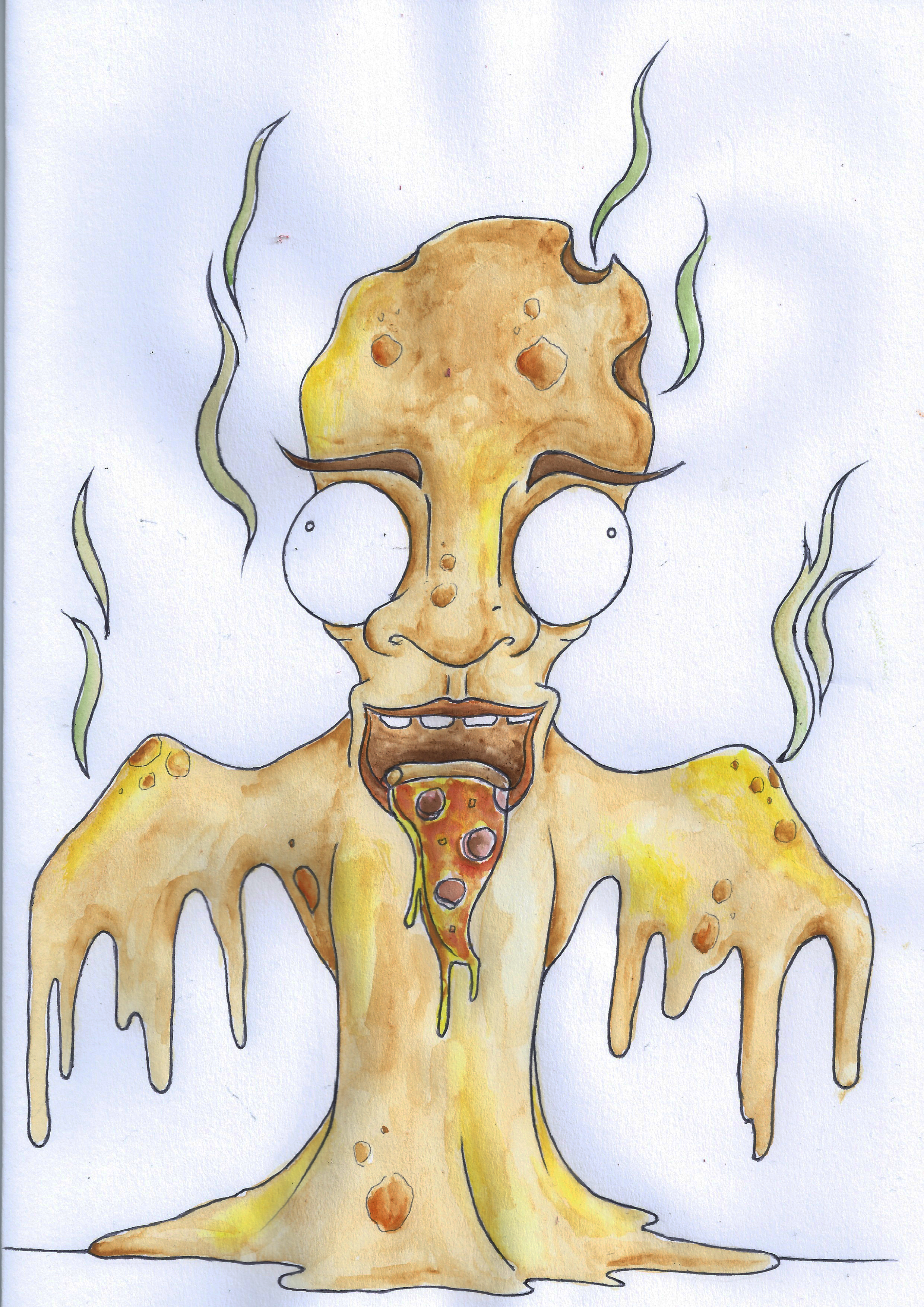
For this term at Uni I would be working towards producing a Zine as my final outcome. The theme of my zine had to be based around “Food Culture”. We had to explore how text and image could work together as a piece of work. Exploring digital lettering and hand drawn type – whilst also looking at a number of different mediums.

To initiate our work for the project, we were set an brief; which involved responding to a news article associated with our chosen theme. 

We had to produce a piece of artwork with a dimension of 80mm x 120mm.

We also had two days in which to produce this & submit digitally to our lecturers.

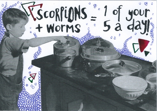
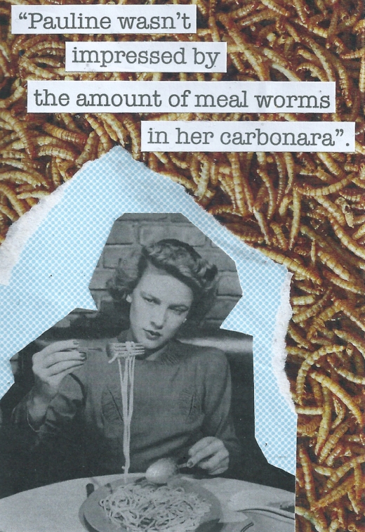
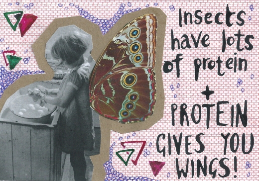
I really wanted to explore collage for this brief, as I had been researching Hannah Höch. My article was about the benefits of eating insects – I tried to explore the comedy behind the idea of consuming insects – but also try relay the idea of the article; that insects may very well be something we have to rely on as a source of food in the future. 

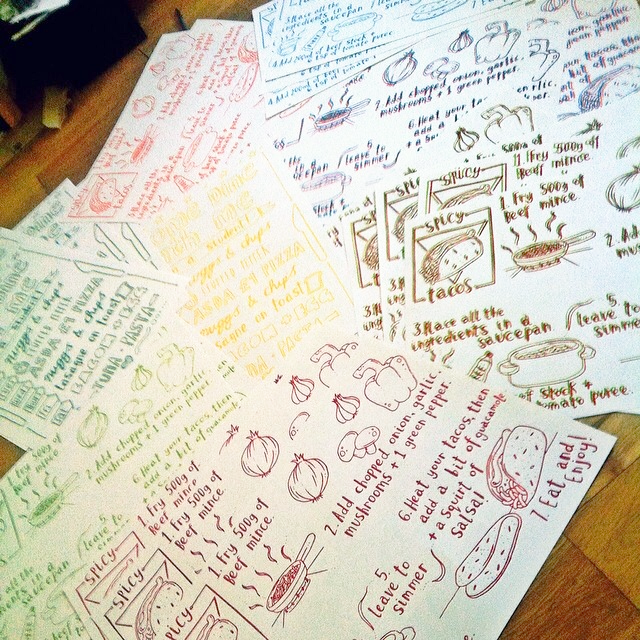
Here are a number of developmental pieces:

Image

Image

Image


Final Submission:

Image
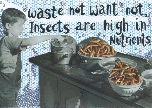
I decided on this piece as the final image, as it was quite simple. I wanted the idea of “eating insects” – to be quite a subtle suggestion, I didn’t want the idea to be immediately obvious – I guess I liked the idea of the audience having to study the image a bit more to realise what’s being prepared on the stove. I used the image of the child exploring the pans because it conveyed the idea of discovering new sources of food. Yet ir maintains the level of humour I wanted to create within the image – the idea of a child seeing what’s for dinner, only to be greeted by a meal – that doesn’t look overly appetising. 

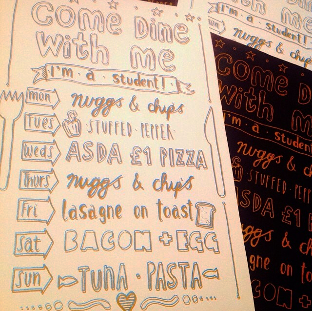
I also liked the font I developed within these series of images – using a dip pen and ink. I like the illustrative quality of handwritten font, and find it gives the piece character & personality. Handwritten font is something I’d definitely like to explore throughout my project. 

The Sketchbook

Our most recent, and last project for this term has been The Sketchbook. Our brief simply stated that we had to fill a sketchbook. I decided to document my daily life – illustrating my interaction with the world. Drawing my friends, food I’ve eaten, favourite quotes, thoughts etc. Recently I’ve been focusing on the combination of text/ font and mu drawings, experimenting with handwritten letters and composition.

Main influences include Danny Gregory and Gemma Correll – a lot of their work is based on their day to day life. They also experiment with text and imagery – Correll adding a lot of humour to her illustrations with a few words.

In my pieces I tried capturing my personality – focusing on humour and sarcasm. Whilst also trying to experiment and push the materials I utilise.


image

image

image

image

image