Illustrator experimentation.

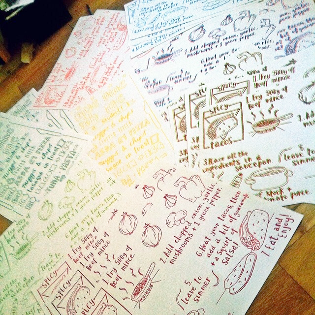
With the drawings I produced to create my screen prints for my taco & butternut squash soup recipes, I scanned them into Illustrator and edited colour into the images. Image


Image

I like how image trace strengthens the line of my drawing – it gives the images more of a graphical appearance. I think the line weight, and bold colours give the image a comic-like quality – which makes the image more fun and attractive. Again, I really like how the font has turned out after being digitally transformed, it reflects the comical/ fun side of the illustrations.

I think it’s interesting to experiment with the same image in different mediums – just too see what medium is stronger for the piece of work. For the context of my final zine, I felt the screen printed recipes were more attractive and complimented my zine more than these digitally edited illustrations.

Screen Printing

Since my return from Berlin, I’ve been really motivated to explore more mediums and techniques. So recently I’ve been making heavy use of the facilities we have on offer in the print room at Uni.

I really found an interest in screen printing – developing a design for a poster; which I intended to be a promotional item with my zine, and a range of recipes that I cook at home too.

“Come Dine With Me – I’m a Student”

A poster to outline a meal plan for a student – intended to be funny be cause of the cheap, bizarre meals. But these all were meals I ate one week at University.

Times are tough & it’s the perfect example of student food culture.

Come Dine with me poster

A day of screen printing = 50 something prints

Recipe Screen Prints

“Spicy Taco & Butternut Squash Chilli Soup Recipes”

With the final set of prints of these recipes, I printed the screen twice – layering the colours. It created this 3D like feel – after staring at them too long your eyes start to feel funny! I really like the strength of the line and how the screen print retains my illustrative style. I also love how well the font printed too – it looks clean and professional.

After producing the prints, I cut the prints in half  to produce a mini concertina book – which I later included within my zine as pull out recipe cards!

Taco screen print

Butternut screen print

The Sketchbook

Our most recent, and last project for this term has been The Sketchbook. Our brief simply stated that we had to fill a sketchbook. I decided to document my daily life – illustrating my interaction with the world. Drawing my friends, food I’ve eaten, favourite quotes, thoughts etc. Recently I’ve been focusing on the combination of text/ font and mu drawings, experimenting with handwritten letters and composition.

Main influences include Danny Gregory and Gemma Correll – a lot of their work is based on their day to day life. They also experiment with text and imagery – Correll adding a lot of humour to her illustrations with a few words.

In my pieces I tried capturing my personality – focusing on humour and sarcasm. Whilst also trying to experiment and push the materials I utilise.


image

image

image

image

image