Etching

This term I’ve been a bit more adventurous by exploring the print room at uni; which I found a bit daunting during my first term! But I’ve made heavy use of the facilities – producing a number of etchings, screen prints and letterpress prints. 

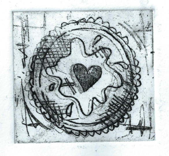
I signed up to a workshop with David Price, in which I produced a soft ground and hard ground etching. 

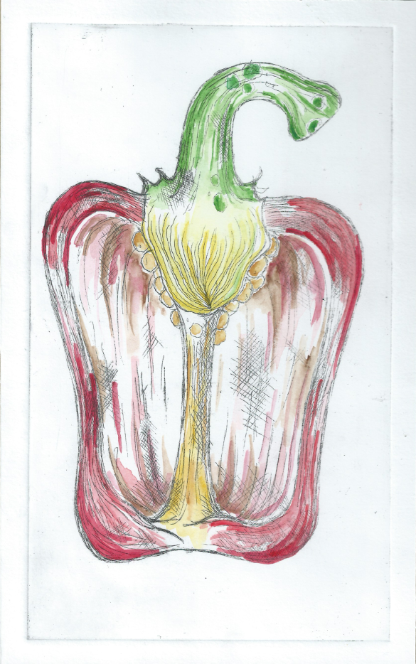
Hard ground creates a harder print – using a copper pen, you draw the design onto the plate. After being placed in the acid, the line etched onto the plate is very strong and defined – there isn’t any texture & the final print is very solid. 

Soft ground produces a softer image. When drawing your design onto the plate you can use pencils and graphite sticks to create a line that isn’t so defined. The resulting prints appear as though they’ve been drawn, as the line quality maintains the texture of the physical material used to create the design.

Hard Ground Pepper, with Water Colour:

Image


Soft Ground Jammy Dodger:

Image


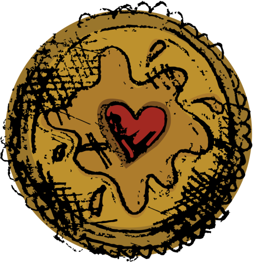
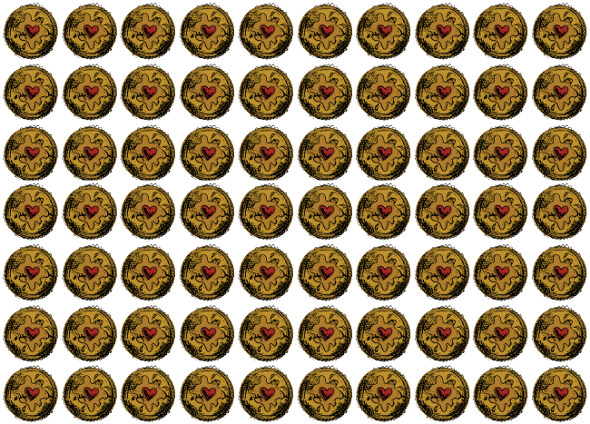
I took my soft ground etching, scanned it into Adobe Illustrator and experimented with image trace & colour. I created a pattern to be featured as end pages to my final zine. I quite liked how the image trace retained the quality of soft ground etching; creating a graphical illustration with a hand drawn appearance. 
Image


Image

Japanese Bookbinding

Last week I took part in another Graphics workshop, where I learnt the art of Japanese Bookbinding.

A simplistic technique, which didn’t take at all long to do!

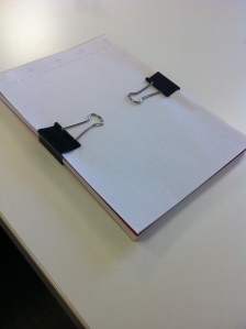
We took a decent amount of paper – sufficient enough for a sketchbook! All the pages were cut to size, this way the book would have a neat, professional edge/ finish to the book pages.

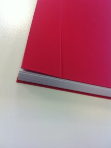
Then with two pieces of card, we created the front and back cover. Using a machine, we create an indentation along the margin of the front cover – making it easier to open and close the book (See pictures below).

photo 2-2


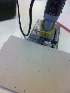
With a template, we then used a mechanical drill to create 5 even holes – distributed along the edge of the book that would essentially form the spine where you bind.

photo 1-2


photo 3-2


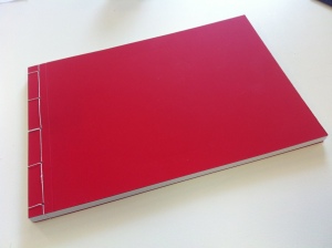
Using book binding thread & a large needle, we bound the pages together. Using a ancient Japanese binding method; looping the thread through the holes, slowly progressing up the spine. At the end – we tied it tightly with a good safe knot & our book was complete!

photo 5-2


It was a very quick technique, and we’re allowed to use the graphic departments facilities in the future – if we desire. In order to create our own books. Next term I’d definitely like to bind my own sketchbooks, investing in some binding thread and needles & you’re set to create a good amount of handmade sketchbooks!

Berlin

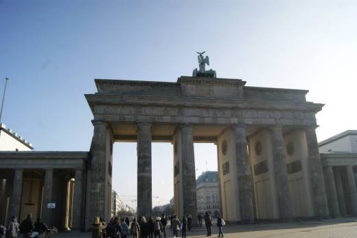
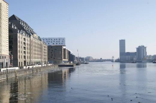
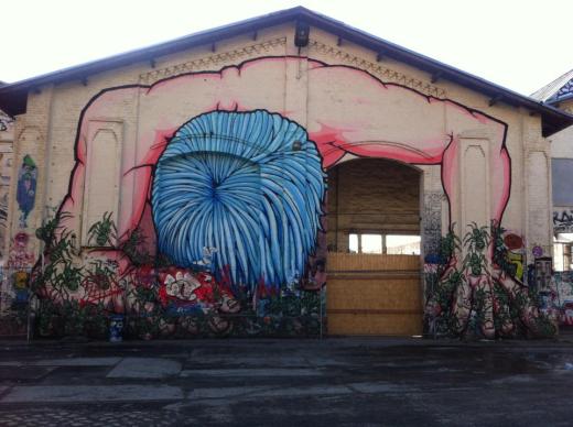
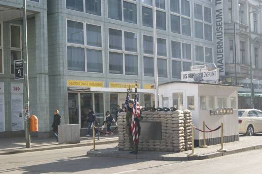
At the beginning of February, I had the pleasure of jetting off to Berlin for 5 days! I’d never been before, so it was a really great experience to venture around the culture of the city. Everyday me and my mates were up at 9:30am, off exploring Berlin & making heavy use of the train network.

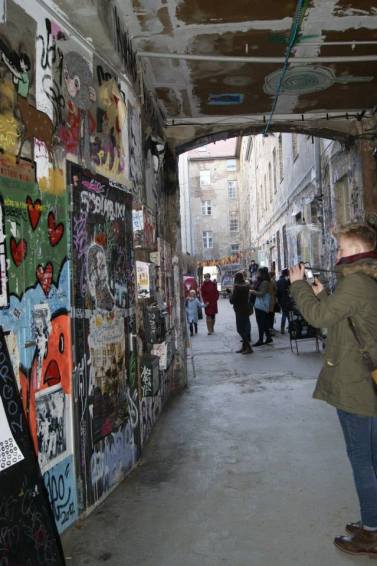
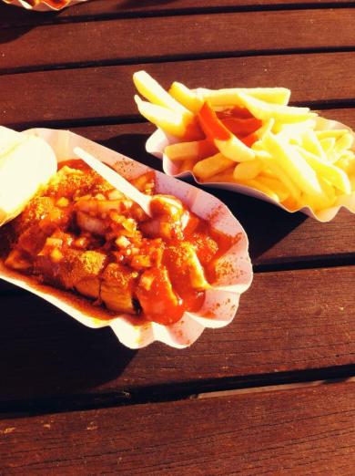
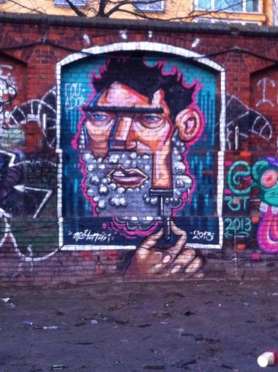
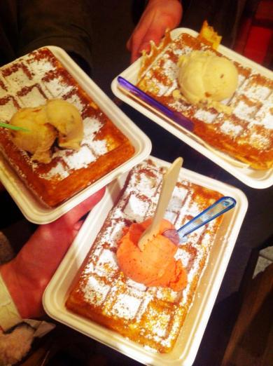
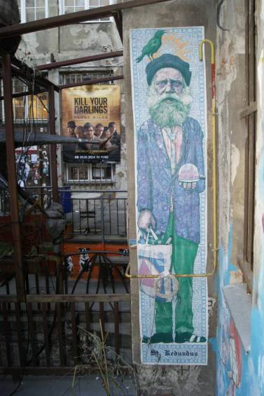
Here a few snaps from my adventures in Germany!

ImageImage

Image


Image


Image


Image


Image


Image


Image


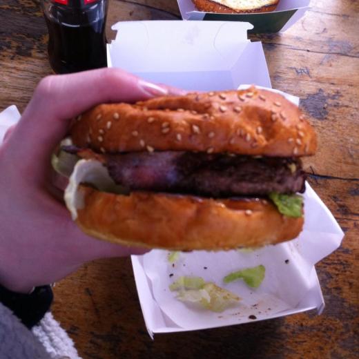
THE BEST BURGER EVER:


Image


Image


These are only a small selection from my camera, hopefully I’ll update with more soon!

Letterpress

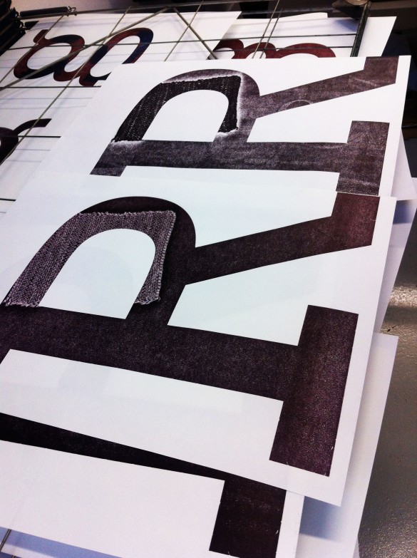
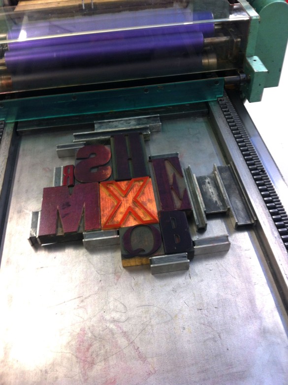
After taking part in the digital letterpress workshop, I was really looking forward to using the actual letterpress in my Visual Communication workshop.

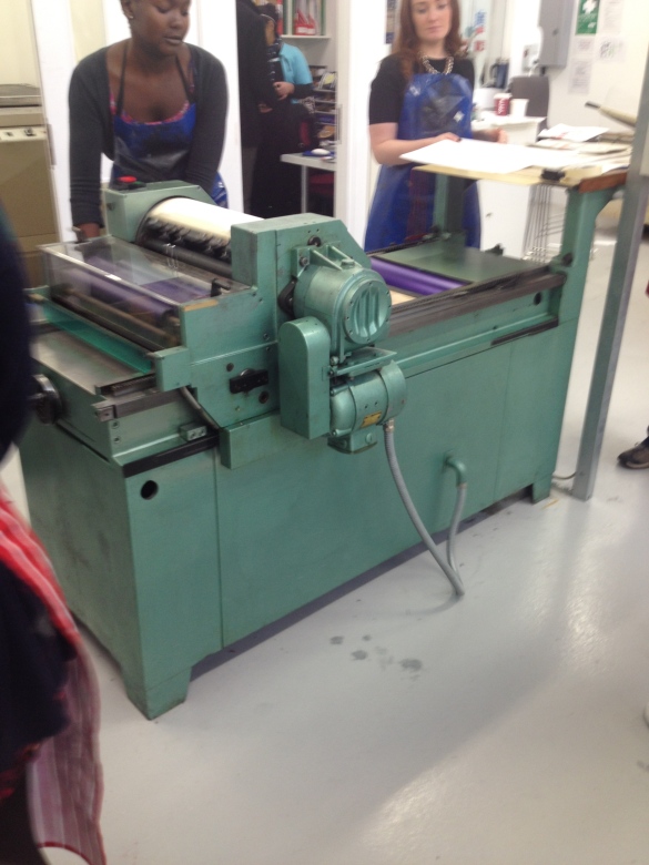
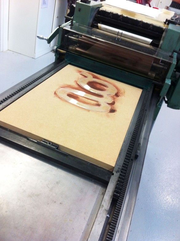
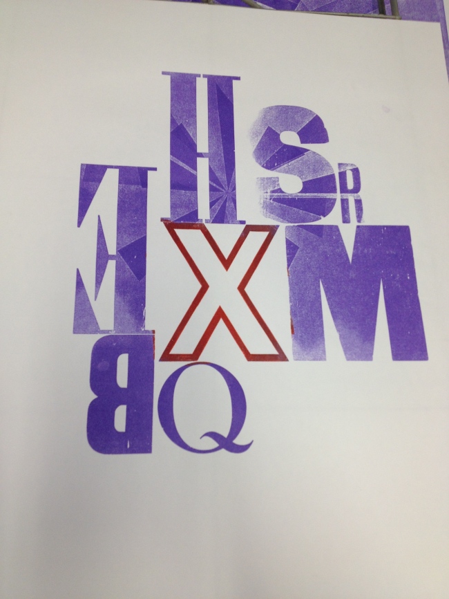
We all selected a number of different type, from the vis com studios. Which we then took down to the print studio and experimented with layouts and pressure of the letterpress.

Here are some photos taken during the workshop – 

Image


Image


Image


Image


Image

With this image, we experimented with collage – creating a relief pattern which we placed underneath the sheet of paper we would be printing onto. It resulted in the press picking up the layered collaged elements – creating a patter within the letterpress print.

I really enjoyed letterpress, it was a really quick and simple way of producing prints. I plan on arranging with the print technicians to utilise the letterpress in order to produce a series of posters for my final zine!

Explosive Drawing

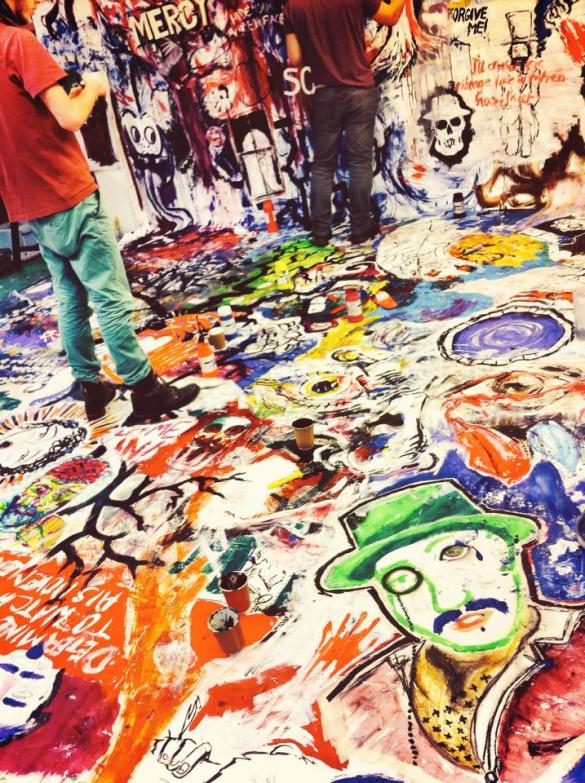
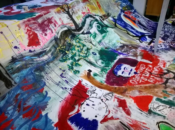
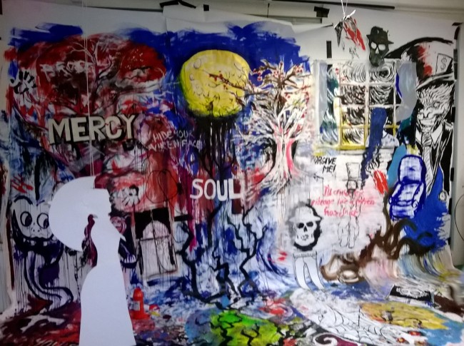
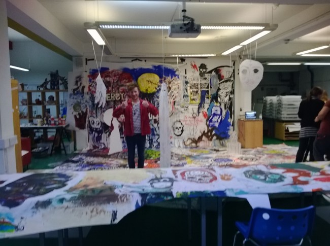
This workshop involved covering a large proportion of the illustration studio in large sheets of white paper – essentially forming a giant canvas! For the duration of the workshop we listened and audio adaptation of Emily Brontë’s Wuthering Heights – and with a range of different mediums we would visually respond to the audio book.

We collectively utilised acrylic paints, water colour, inks, pen, pencil, crayons – the list is endless! But after several hours of drawing, a giant collaborative piece began to come to life. After our lunch break – we could edit the canvas with white paint – blocking out areas to highlight other images that stood out more; to create a less hectic image.

Towards the conclusion of the workshop we began to edit the canvas further, by having cut out people and birds. We also had a range of different pieces hanging from the ceiling – it really made the collaboration come to life.

Here are some snaps from the workshop –

Image

Image

Image

Image

I really enjoyed this workshop, it was a really interesting concept. We were encouraged to draw over other peoples work – concentrating on the image we were creating. But it was a really interesting concept at the conclusion of the workshop, to see everyones efforts come together. Initially I thought it would be a bit messy and hectic, but after editing the canvas & hanging pieces from the ceiling, it was a really cool outcome.

It was nice to relax, paint and draw – and also have a roll around on a giant piece of paper.

The perfect day for an illustrator.

Digital Letterpress

During our Visual Thinking unit, we had the ability to sign up to a number of other courses’ lectures and workshops (Graphics, Fine Art & Visual Communication).

I was quite excited about the prospect of what I like to call; CROSS – COURSE CONTAMINATION!

One of the first workshops I signed up to was a Graphics workshop, learning how to letterpress – digitally…

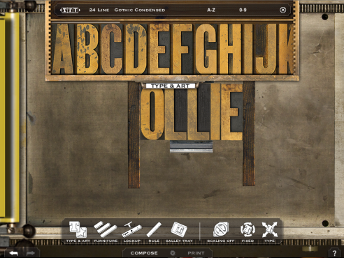
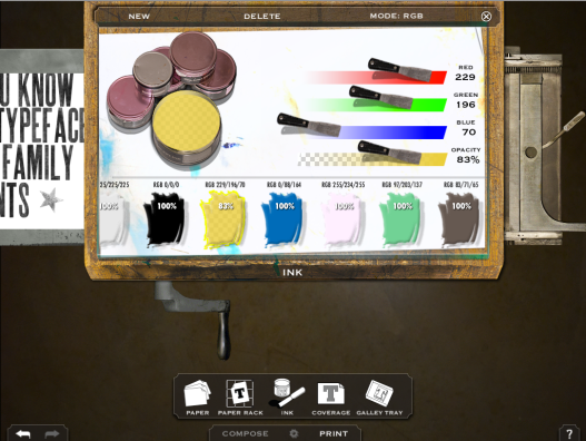
We used a programme called Letter M Press

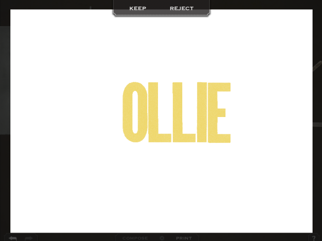
Essentially it does what it says on the tin – it’s a digital interpretation of a real letterpress. You can place the letters, use magnets and rulers to arranged the type ink up the letters with the rollers & even pull the roller to print the letterpress. It produces a digital image which had the appearance of a real life letterpress print. 

ImageImage

Image

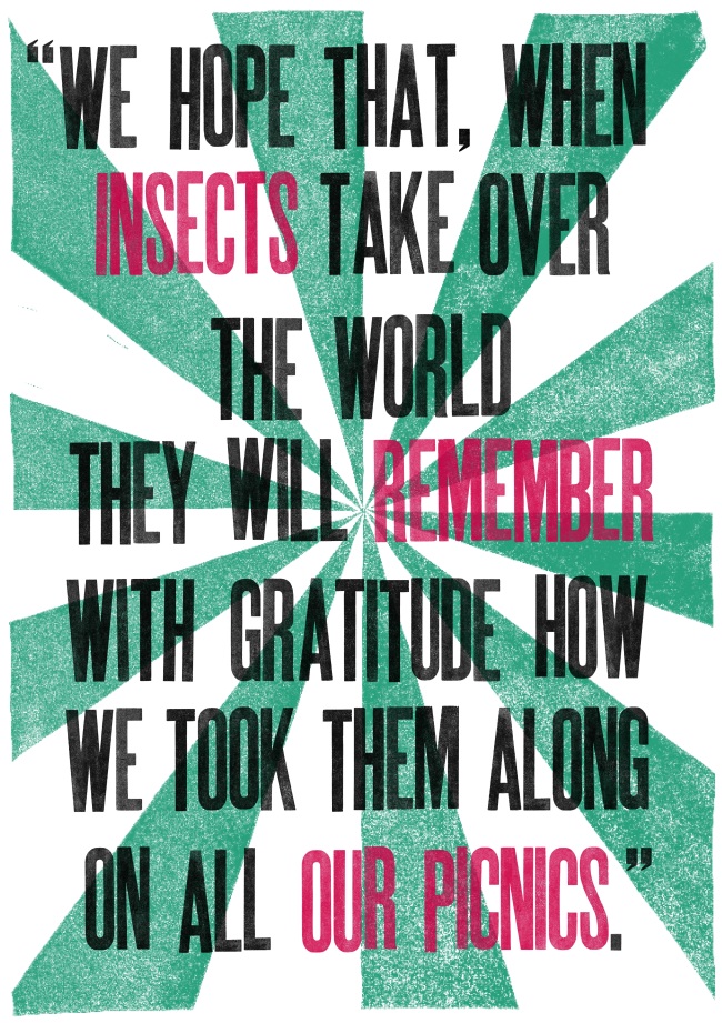
I spent a good amount of the workshop working on this particular print (Pictured below) – a quote I found online, by Bill Vaughan. I really liked the quote, and wanted to create a poster for it – I find it quite authoritative, and like the strength it gives the quote. The quote is fairly comical, so the structure and colours used within the print somehow manage to place it in some sort of serious context.

Image


It’s a really easy programme to use and would recommend to anyone that doesn’t have experience or access to an actual letterpress.

I have signed up to a Vis Com lecture – in which I’ll actually be using the letterpress we have in the Uni Print Room – So I can only make a real comparison when I’ve taken part in that workshop! 

 
However, Letter M Press is available on the Apple App Store for £6.99 – so having recently invested in a MacBook, I’ll definitely be downloading the programme for future use!


Visual Thinking; Food Culture & The Editorial Brief

For this term at Uni I would be working towards producing a Zine as my final outcome. The theme of my zine had to be based around “Food Culture”. We had to explore how text and image could work together as a piece of work. Exploring digital lettering and hand drawn type – whilst also looking at a number of different mediums.

To initiate our work for the project, we were set an brief; which involved responding to a news article associated with our chosen theme. 

We had to produce a piece of artwork with a dimension of 80mm x 120mm.

We also had two days in which to produce this & submit digitally to our lecturers.

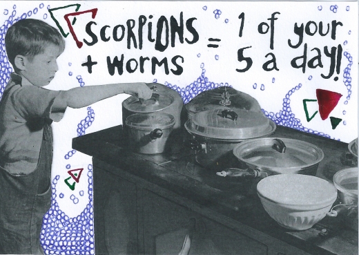
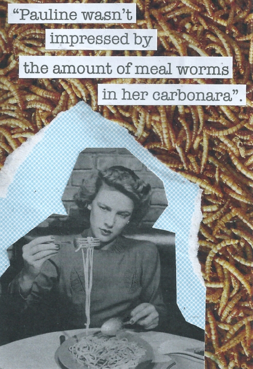
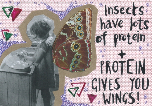
I really wanted to explore collage for this brief, as I had been researching Hannah Höch. My article was about the benefits of eating insects – I tried to explore the comedy behind the idea of consuming insects – but also try relay the idea of the article; that insects may very well be something we have to rely on as a source of food in the future. 

Here are a number of developmental pieces:

Image

Image

Image


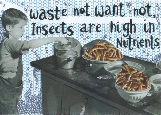
Final Submission:

ImageI decided on this piece as the final image, as it was quite simple. I wanted the idea of “eating insects” – to be quite a subtle suggestion, I didn’t want the idea to be immediately obvious – I guess I liked the idea of the audience having to study the image a bit more to realise what’s being prepared on the stove. I used the image of the child exploring the pans because it conveyed the idea of discovering new sources of food. Yet ir maintains the level of humour I wanted to create within the image – the idea of a child seeing what’s for dinner, only to be greeted by a meal – that doesn’t look overly appetising. 

I also liked the font I developed within these series of images – using a dip pen and ink. I like the illustrative quality of handwritten font, and find it gives the piece character & personality. Handwritten font is something I’d definitely like to explore throughout my project.