BILBO – Final Animation

“It is inevitable that we will all experience bereavement at some point in our lives after the death of a partner, relative, friend or pet. Grief manifests itself in a range of different ways, and although we know it is an inevitability – how we understand death and accept it when it occurs can be unpredictable. “Bilbo”  is a 2D stop motion animation, which illustrates the relationship between an owner and his cat – subtly approaching the idea of the cat’s passing – showing the void left, yet presenting the idea that life continues.  My main intention for my animation is for it to act as a supportive film for young children dealing with the loss of a pet. I’d like for it to encourage the remembrance of a life, whilst also offering up conversation and discussion between parents and children – aiding explanation and support”

So above is my final outcome for the Convergence/ Divergence unit – something a few weeks ago I didn’t even think was possible. As an illustrator, this entire project has put me out of my comfort zone. “Animation” is a terrifying word, and still sends shivers down my spine now. But after rendering my final animation, I couldn’t help but sit back grinning and watching it multiple times.

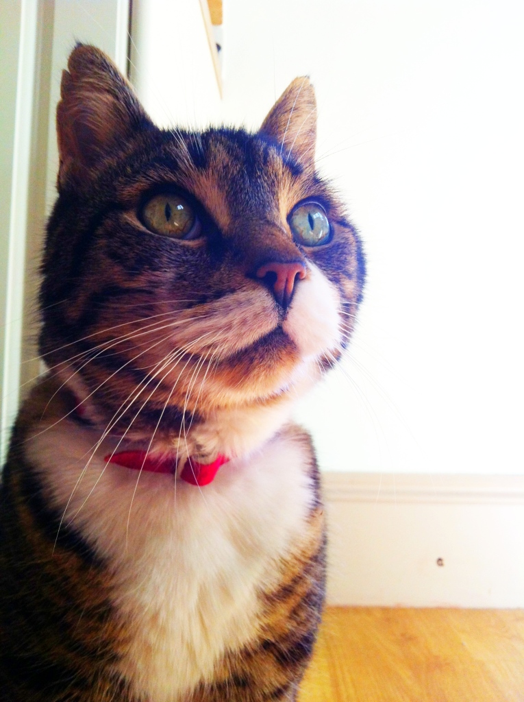
Something I’ve been really interested in since Level 4, is illustrating for children – but I’ve also had a real interest in working on projects that tackle difficult or taboo subjects for children. In order to move forward with my progression as an illustrator – and towards the end of my time on Level 5, this was an interest I wanted to continue to carry forward. About a week before we were briefed for the project I sadly had to say goodbye to my pet cat – who I’d had since I was 5 years old. It was this event in my personal life that informed my practice, I hadn’t yet approached death within my work as I think it’s a subject that has to be dealt with the upmost care and sensitivity – especially with children. But this project not only allowed me to grieve, but allowed me to channel that grief and inform the context of my animation. For instance the scenes that involve the cat as all experiences I’ve had as an owner – it’s a very personal film – yet easily associable by any other pet owner.

Although we were being asked to produce an animation – I didn’t want to leave behind my individuality, style and what interests me as an illustrator. Something I always knew I wanted to retain within my animation was my illustrative style. I also wanted to be comfortable in the way I was producing work – I don’t often work digitally, so it was a case of choosing a direction of animation that would not only allow me to retain my current working method – but also project it into a digital format. Stop frame motion was the perfect technique. I think a big challenge with animating my drawings was having to visualise them as separate components – it was a very thought out process, getting my head around which bits needed to be drawn separately in order to be easily manipulated during the animation process.

If I were to do the animation again there’s probably a number of things I would change (some of them are very minute issues which only play on my mind – so I won’t point them all out to your eyes!) But I would definitely have liked to have a bit more continuity with the lighting of the images – something probably affected by the exposure of the camera during the photographing of the animation. However, the lighting creates these wonderful shadows which people have picked up upon. Visually I find it really interesting, you can see it’s paper cut outs – and this isn’t something I want to try hide or make it appear like it hasn’t been done with 2D cut outs. But it’s a stop frame animation, and I think along with my illustrations and the imperfections in regards to shadows and lighting give it a certain amount of attractiveness. It’s a really charming video and I’m really proud of what I’ve produced. I’ve had a huge amount of positive feedback from various people, they’ve all found it very emotional and all had a personal connection – with regards to their own experiences.

It’s been a challenging – but weirdly enjoyable experience & it’s something I’d definitely like to do again.

But for now I need an excessive amount of tea & a good nights sleep where I’m not dreaming about animating a pink cat.

This one’s for you Bilbo, big love x
IMG_1286

Final Pieces

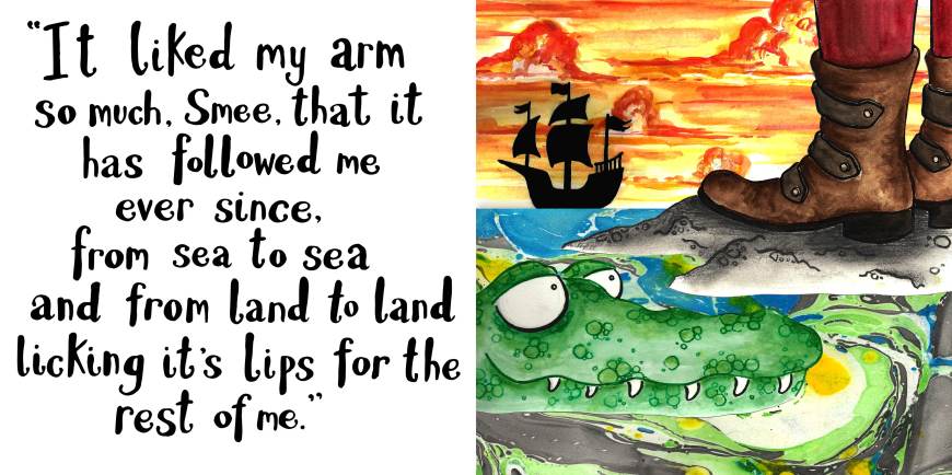
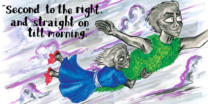
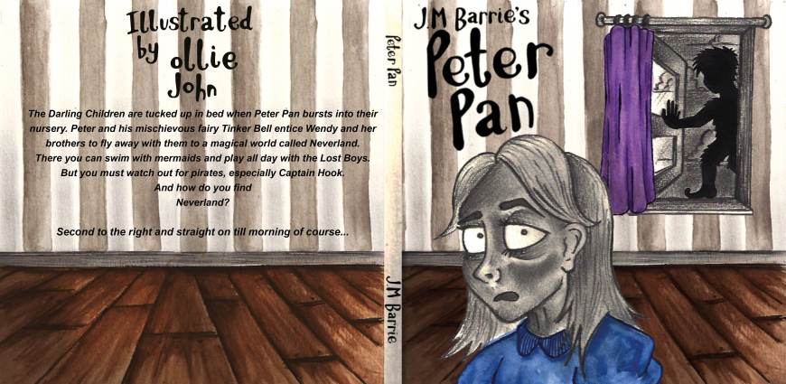
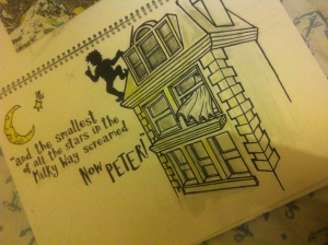
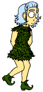
These were my 3 final pieces. I mainly wanted to convey the idea of a story that’s all together magical – yet quite dark and sinister at the same time. Obviously not too dark for my target audience, but I felt it helped reflect the question on everyone’s lips – who is Peter Pan?

Hook Feet Final Page

Peter Pan & Wendy Final

FRONT COVER FINAL EDIT

London & Poole Park Research Trip.

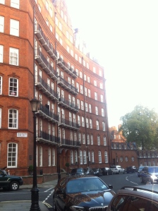
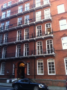
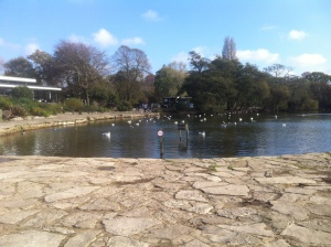
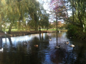
I reached a stage during my character development where I think I’d lost my style, the characters had all become very flat and boring. They weren’t exciting me, and I couldn’t picture them springing to life on the page – so if I couldn’t see it, there’s no way a child would either. So I took a break from character design and set off to Kensington and Poole Park to gather some context in order to create environments for my characters. Here are a few photos from my day trips and some images that they informed.IMG_6886

IMG_6887

IMG_6942

IMG_6958

IMG_7102

IMG_7101

10690193_10152514645303284_8825514750088754802_n

Children’s Books – Peter Pan

For my first project of second year, I was asked to interpret J.M Barrie’s Peter Pan. Initially I looked into what children’s books were on the market now, what’s out there that works, and what can I do in order to produce a successful outcome. I also did a bit or market research, talking to parents and children, asking what their favourite books where, and why they bought the books/ enjoyed them. Colour and entertaining images seemed to be an important attribute that the families looked out for.

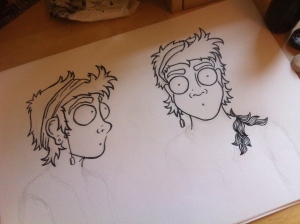
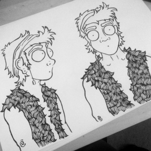
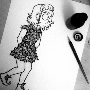
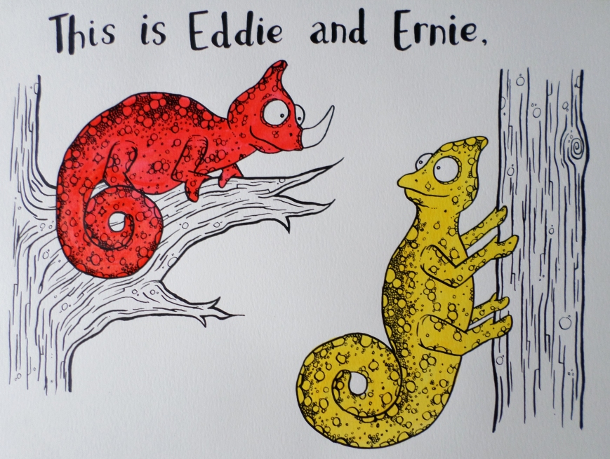
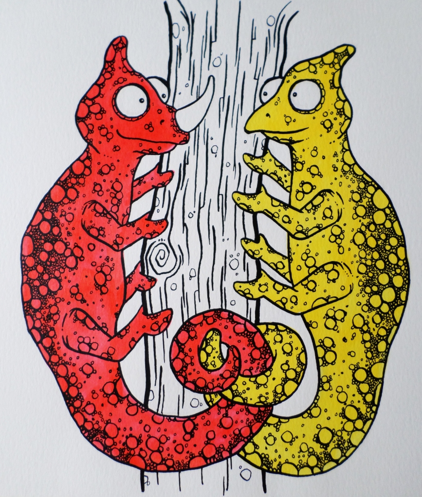
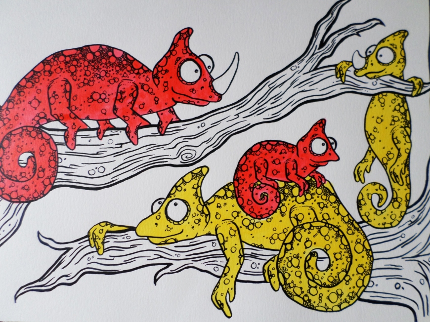
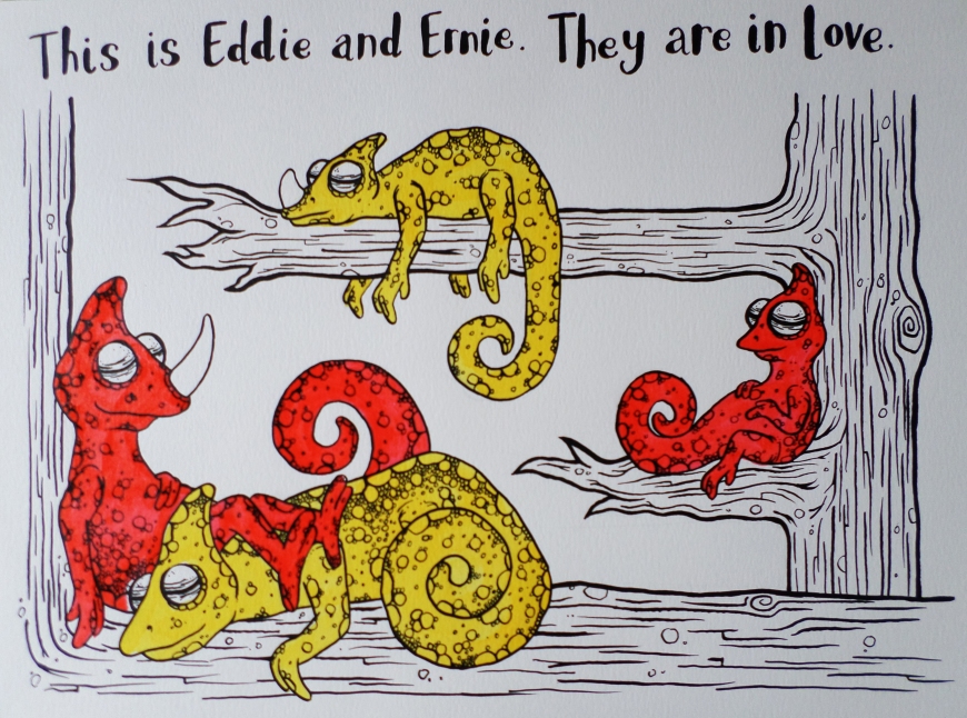
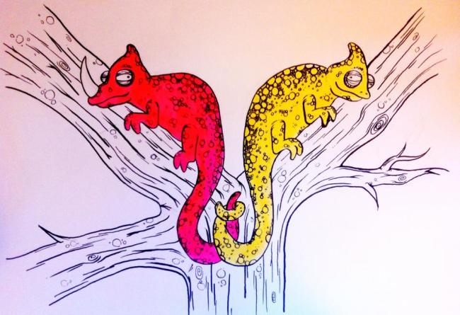
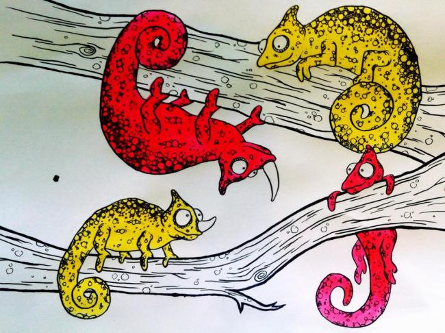
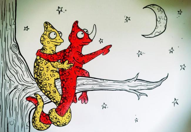
I began by focusing on character design –  producing images which were trying to extend the style I had developed in my last project of first year – Eddie and Ernie, using a dip pen and black ink to produce my first character designs

IMG_7099
Peter


IMG_6724

IMG_6731

IMG_6752


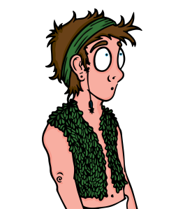
I also took my favourite images and digitally edited these on Adobe Illustrator…

Peter pan Tinkerbell copy

Working with Ink

As I started progressing through my final unit, I became very interested in working with drawing inks and using dip pens.

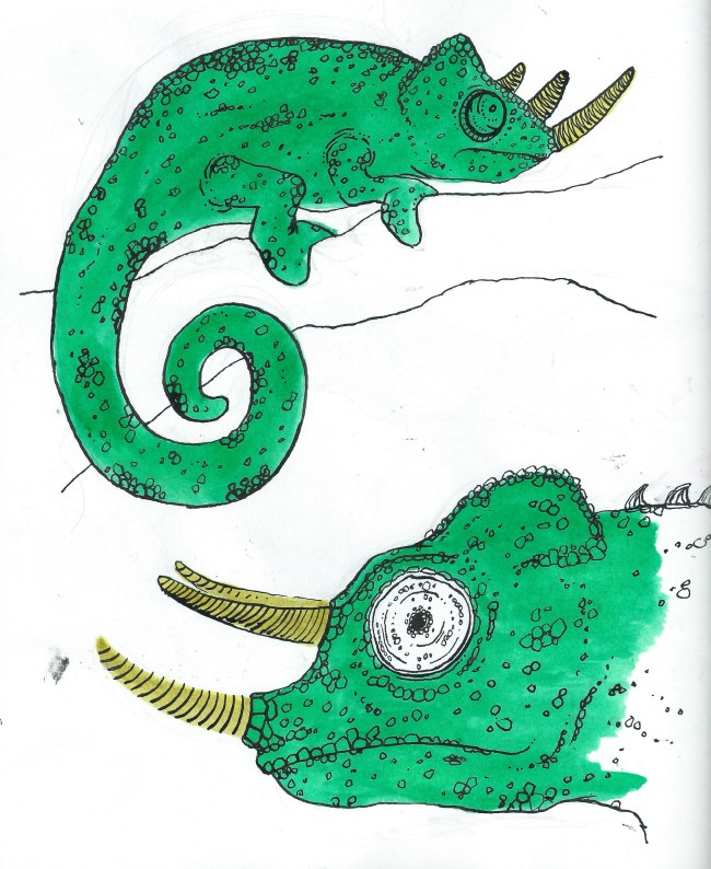
I own a set of Windsor & Newton inks – which have a really strong colour – which I find really attractive. So have been using these really heavily. I tried to use colours that weren’t usually associated with the animals I was drawing. I had decided that I was going to create a short 8-12 paged illustrative narrative, that dealt with a gay couple in a relationship. Rather than simply focusing on the idea that these characters are gay – the narrative will be more about the concept and meaning of a relationship between two people. 

ImageImageImageImage

Character Designs/ Story Concepts

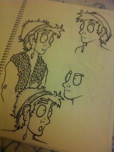
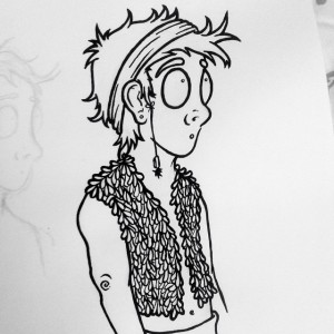
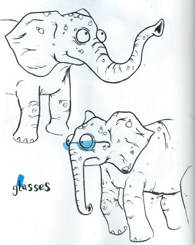
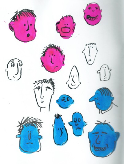
I initially ran into the project quite excited and got straight into designing characters and scenes – I had a lot of ideas in my head and it just felt right to get early ideas out onto the page so I could begin to get my head around the characters and story working together in context.

I initially began by creating A4 biro drawings – which took ages to do as I had to keep going over the line to make it thicker – so biro’s are now longer in my pencil case!

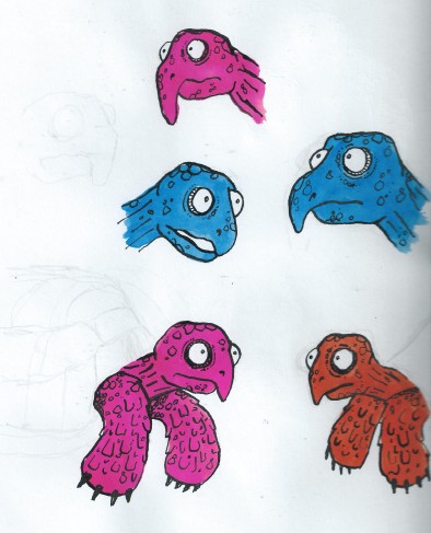
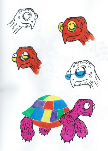
I then took these drawings and scanned them into Adobe Illustrator, then using live trace – coloured the images.

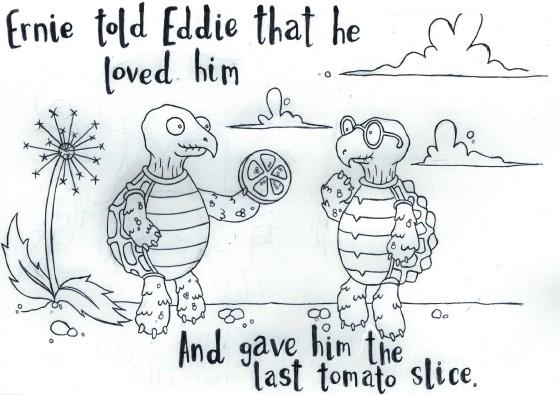
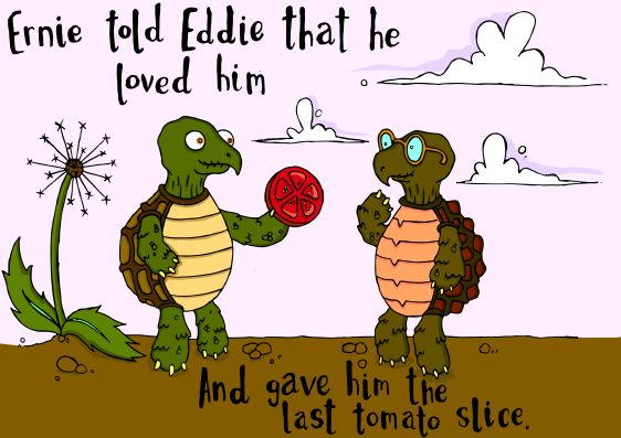
TORTOISES

ImageImage


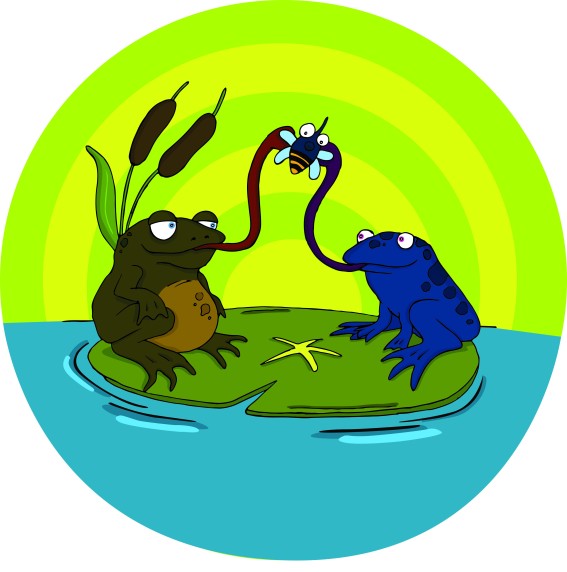
FROGS

Image


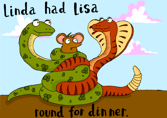
SNAKES

Image


DINOSAURS

Image

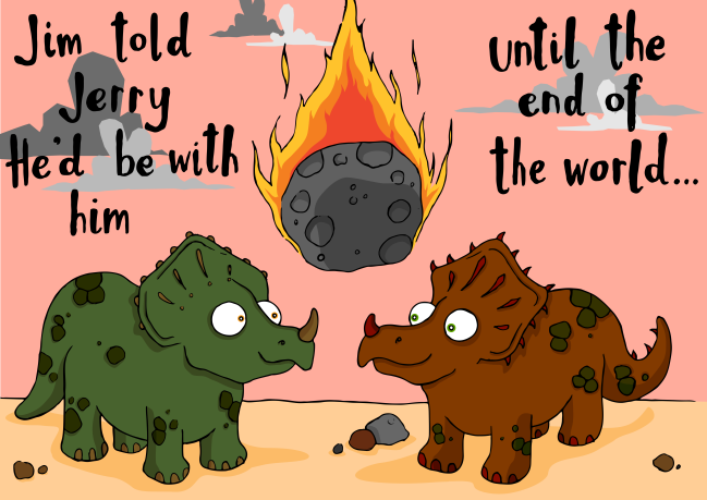
After visiting my friends younger brother for some research, he told me that his favourite animals were dinosaurs (Slightly awesome cause I got to draw a load of dinosaurs) They were my favourite characters that I had designed, and I quite liked the humour behind the image and after I posted it on Facebook it got a very good response! – My brother went so far as to call it “heartbreaking!”

However my work on illustrator was taking far too long, with up to 3 hours being spent on colouring the images alone! I didn’t feel like it was a productive way of working, so stripped it all back, and my focus then revolved around character design & who would fit the mould for my narrative. 

Locating Practice// Narrative Illustration.

The end of my first year is almost in sight – but I still have one more project to go! This term we were asked to focus on considering the functions of illustration and the contexts for illustration practice. We could select from several different contexts – such as toy making, portraiture, animation, reportage etc and then had to write our own personal brief.

I decided on looking into Narrative Illustration.

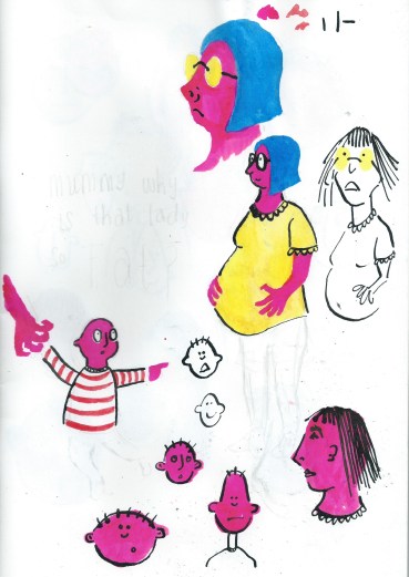
I had the initial idea of looking at the “unanswerable” questions that children asks parents:

  • Where do babies come from?
  • Where do we go when we die?
  • Is god real? etc.

Below are two pages where I began to explore this idea, and some character design…

Image Image


However I soon decided to explore a different idea.


After stumbling across some “Mummy’s forum” on the internet – looking for answers to “unanswerable questions” – I found one that really stood out for me; 

Child: “Mum, why is that man kissing that man and holding hands?”

Mum: “The same reason your father and I do, they love each other”


This post had quite a number of divided opinions on how you should – or even IF you should explain the concept of a same-sex relationship to a child!
Given the recent legalisation of Gay Marriage on March 29th 2014, I thought it would be interesting to explore how – or even if – there were illustrated children’s books that explored same-sex relationships.  

It felt quite relevant and appropriate to research and develop an illustrated children’s narrative that focused on a same-sex relationship. 

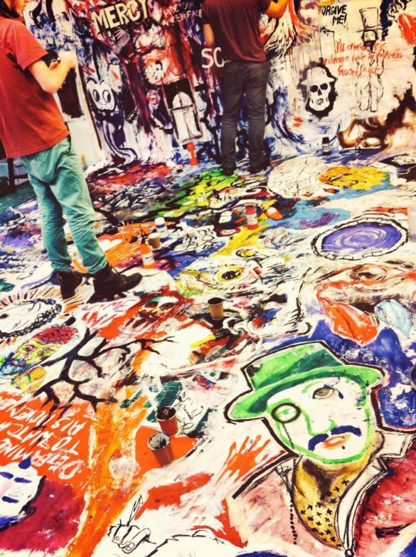
Explosive Drawing

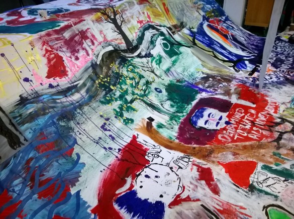
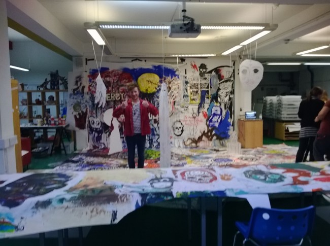
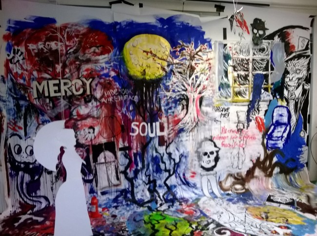
This workshop involved covering a large proportion of the illustration studio in large sheets of white paper – essentially forming a giant canvas! For the duration of the workshop we listened and audio adaptation of Emily Brontë’s Wuthering Heights – and with a range of different mediums we would visually respond to the audio book.

We collectively utilised acrylic paints, water colour, inks, pen, pencil, crayons – the list is endless! But after several hours of drawing, a giant collaborative piece began to come to life. After our lunch break – we could edit the canvas with white paint – blocking out areas to highlight other images that stood out more; to create a less hectic image.

Towards the conclusion of the workshop we began to edit the canvas further, by having cut out people and birds. We also had a range of different pieces hanging from the ceiling – it really made the collaboration come to life.

Here are some snaps from the workshop –

Image

Image

Image

Image

I really enjoyed this workshop, it was a really interesting concept. We were encouraged to draw over other peoples work – concentrating on the image we were creating. But it was a really interesting concept at the conclusion of the workshop, to see everyones efforts come together. Initially I thought it would be a bit messy and hectic, but after editing the canvas & hanging pieces from the ceiling, it was a really cool outcome.

It was nice to relax, paint and draw – and also have a roll around on a giant piece of paper.

The perfect day for an illustrator.